 illustration: Reporterzy.info and Dwornik.pl
The concept of mind hacking is gaining popularity, especially on social media. Social media is a place where we have very little time to capture attention and stand out amid a sea of competing messages. According to META Foresight statistics, a single post on Facebook or Instagram appears on screen for an average of 1.7 seconds. That’s all the time the message has to engage viewers and prompt interaction.
Under these conditions, the saying “a picture is worth a thousand words” becomes especially useful - and it really works. The human brain processes visual information much faster than text or spoken words. Scientists at the Massachusetts Institute of Technology measured and calculated this quite precisely. Let’s take a red rectangle as an example.
- Red rectangle
Image: 0.013 seconds
Speech: 1 second
Difference: 77 times faster - Red rectangle with yellow dots
Image: still 0.013 seconds
Speech: 2 seconds
Difference: 154 times faster - For more complex patterns, the difference can reach up to... 60,000 times faster
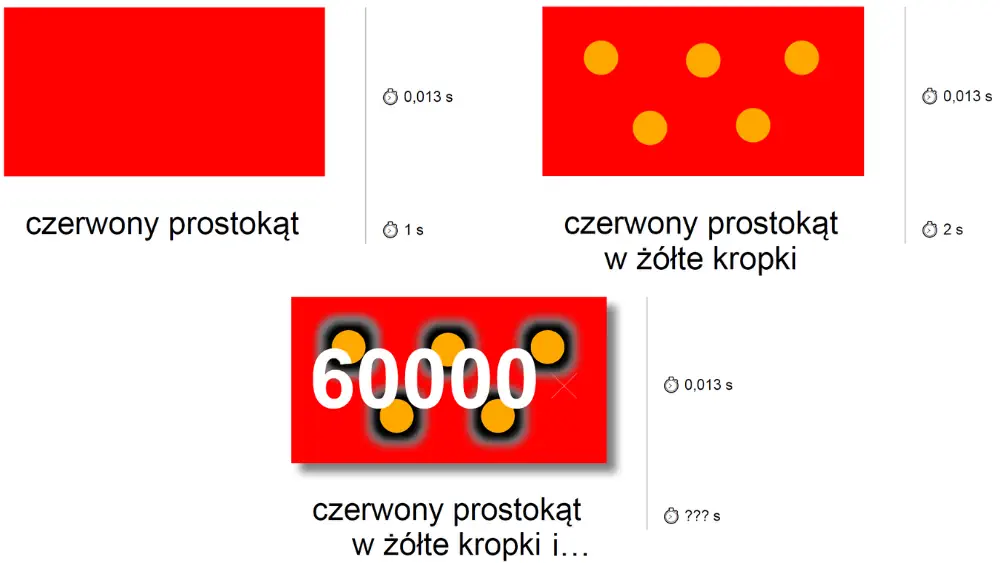 illustration: Dwornik.pl via Massachusetts Institute of Technology
However, the speed at which images convey information is just one part of the equation. What and how we present in an image affects not only the chance of a reaction but also the emotions, associations, and even actions we can trigger in the viewer. This is the essence of eyecatchers.
The Power of Color
Bright, long-wave colors are the most stimulating and attention-grabbing, according to EEG research. This is confirmed by a study conducted in 2004 by Naz Kaya and Helen Epps, published in the College Student Journal under the title Relationship between Color and Emotion. Most people react most strongly to shades of red and yellow.
But one thing must be remembered: contrast. Bright colors are most noticeable against a neutral background. However, to stand out amidst a sea of brightness, you need to take the opposite approach.
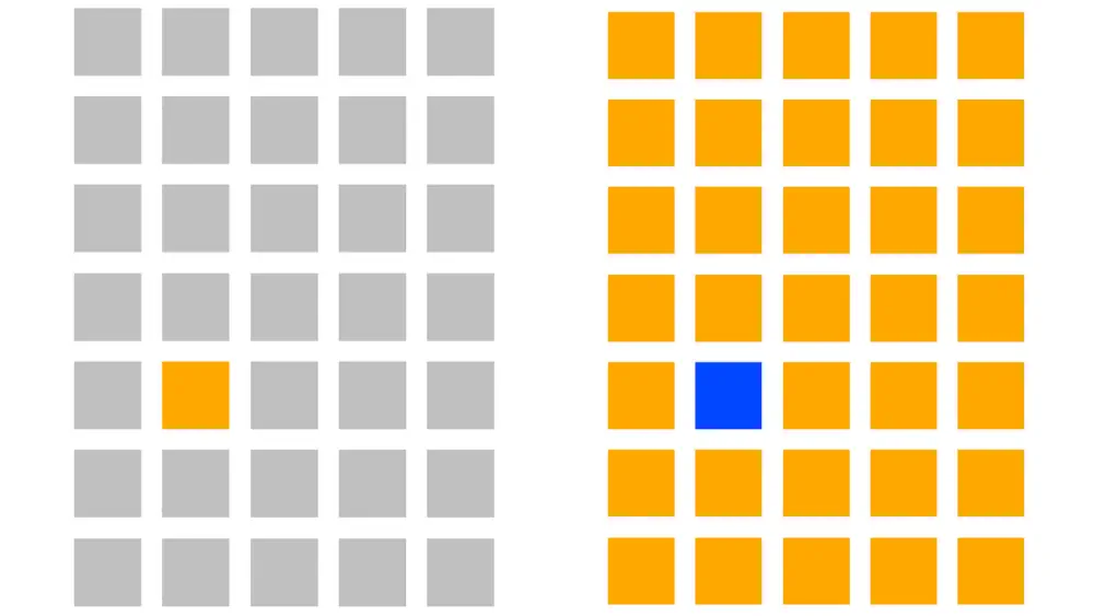 illustration: Dwornik.pl via Kaya, N., Epps, H. (2004). Relationship between Color and Emotion
Arrangement of Elements
Most of us pay more attention to graphic elements with an arrangement that is surprising, unusual, or somewhat disrupted. Tomasz Brusik from Rysujefejsbuki.pl presents many intriguing examples and uses. You can find them all at https://rysujefejsbuki.pl/poradnik/eye-catchery/. Here are a few examples:
- DIAGONALS create a sense of movement and add dynamism.
- LINE BREAKS AND DEPTH give an impression of perspective and three-dimensionality.
- MINIMALISM, or a single isolated element, stands out more than several that split attention.
- ASYMMETRY draws attention, especially when placed in an otherwise symmetrical setting.
Using natural reflexes, which most of us perform unconsciously, can also be beneficial. Two methods (working names) help direct the viewer’s gaze to a specific area or element in the image.
- THE APACHE METHOD. Most people, upon seeing someone intently focused on a specific point, will look there too. Use this to draw attention to a logo, product, or any other element that shouldn`t go unnoticed.

- THE POINTING FINGER METHOD (name inspired by pre-internet times in local print media). When someone points to something, most people instinctively look in that direction. It’s up to you to decide what appears there.
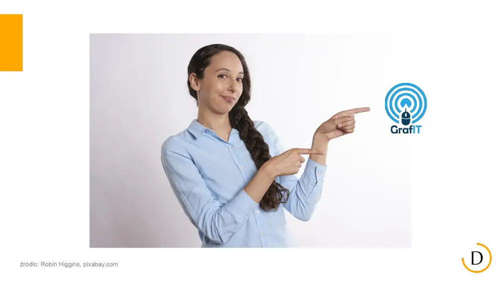
Associations and Emotions
Here’s an important addition to the previous point. If the person looking or pointing shows strong emotions, it’s highly likely these emotions will subconsciously transfer to the viewer. Joy, curiosity, fear, and other intense emotions trigger the so-called reflection effect. And these emotions themselves can be eyecatchers. In capturing attention, a serious expression will generally be less effective.
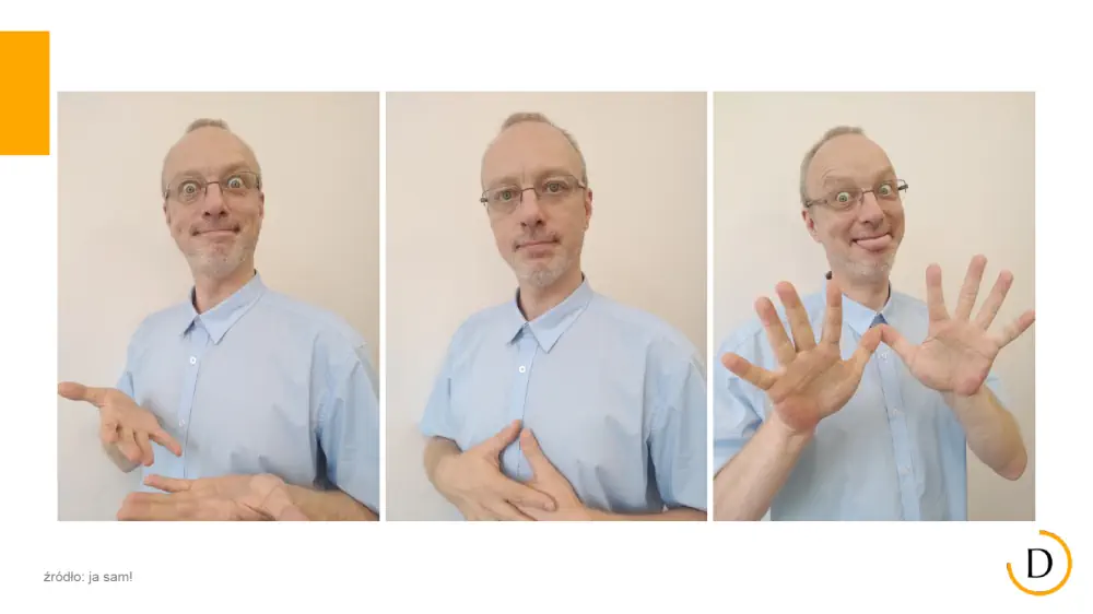
Subconscious associations can also be leveraged to increase the likelihood of achieving the desired impact. Numerous studies, culturally influenced and worth approaching cautiously, support this. However, even these curiosities can be worth testing. The results might be valuable:
- Bearded men inspire more trust. Ads featuring bearded men receive 2.5× more clicks (source: University of Texas)
- Showing a face in a picture (especially a smiling one) increases social media engagement by 38% (source: The Georgia Institute of Technology)
- Pictures of cute kittens perform 69% better than average (source: Digital Doughnut)
- A man with a dog in a photo gets 30% more matches on Tinder (source: Tinder)
- People with glasses are perceived as 36% more professional (source: College of Optometrists)
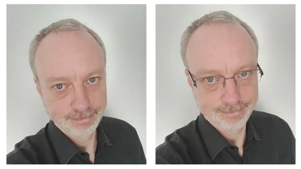
These are just a few examples from a wide array of tricks and methods used by media, advertising, and business psychology professionals to capture our attention. And there’s no magic involved - it’s pure science. It can be studied, measured, and confirmed experimentally. Eyecatchers don’t affect everyone equally, but they are effective in many cases, which is already significant.
***
COMMERCIAL BREAK
New articles in section Skills and knowledge
Artificial intelligence in film and tv production. McKinsey report
Krzysztof Fiedorek
Global spending on video content has reached $180 billion, and the average viewer consumes it for 7.5 hours a day. Streaming is growing by 13%, while traditional television is losing 4% annually. As much as 84% of the US market is controlled by the seven largest players. Additionally, AI technology is reshuffling the market.
War reporter in the new reality. Evolving techniques, same purpose
KFi
What happens when war breaks out just across the border and journalists aren't ready? Polish reporters faced that question after Russia invaded Ukraine in 2022. Lacking training, they improvised: blurred details, hid names, and balanced trauma with truth.
A heuristic trap in media coverage. How loud headlines boost fear
Bartłomiej Dwornik
A negative message that rests on emotion lifts the sense of threat by 57%. Why do reports of a plane crash drive investors away from airline shares? Why do flood stories spark worry about the next deluge? The pattern is irrational yet clear and proven.
See articles on a similar topic:
Visual tricks. How to influence people with color, shape and composition
Bartłomiej Dwornik
The human brain supposedly processes images up to 60,000 times faster than words. Bright colors catch the eye more - but only under certain conditions. Few people can resist the "Apache Method," and a bearded man sells better. Here are some tricks for graphical-optical mind hacking.
Sarcasm in Communication. A Study by INSEAD Researchers
Krzysztof Fiedorek
Sarcasm can be a valuable tool in interpersonal communication, but its effectiveness depends on the context and the relationship between the sender and the receiver. Researchers at INSEAD have shown that well-utilized sarcasm can be a powerful asset in business language and advertising.
Max Weber's Theory of Political Sociology
Krzysztof Dowgird
Max Weber, a German sociologist who lived from 1864 to 1920, was undoubtedly the greatest non-Marxist sociologist of political relations. He had a tremendous and enduring impact on many branches of social sciences, including the sociology of political relations.
Readability: Tools for Journalists to Enhance Text Clarity
Bartłomiej Dwornik
Even the most substantive content must be presented in an accessible and visually appealing way. First, so the reader can understand it. Second, to be easy on the eyes. In both cases, machines can help. Here are some tools for measuring text readability that every journalist might find useful.


